Boards
A user can save any important query outputs (like charts and texts) for future references or make a presentation of all the important query outputs. It can be done by adding those outputs to the Board. Each thread is associated with a single board.
View to expand vizies
To add an insight to a Board:
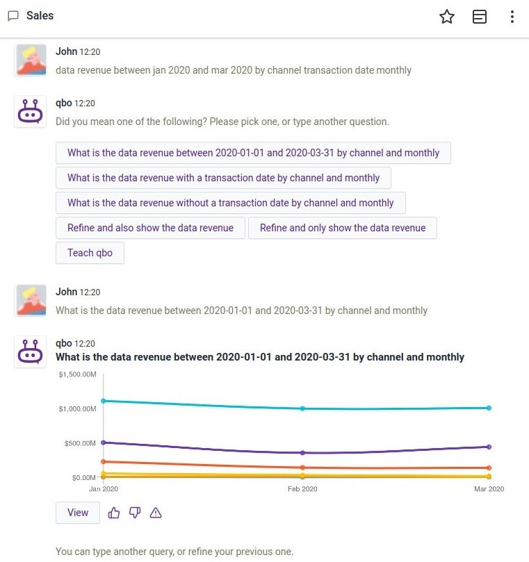
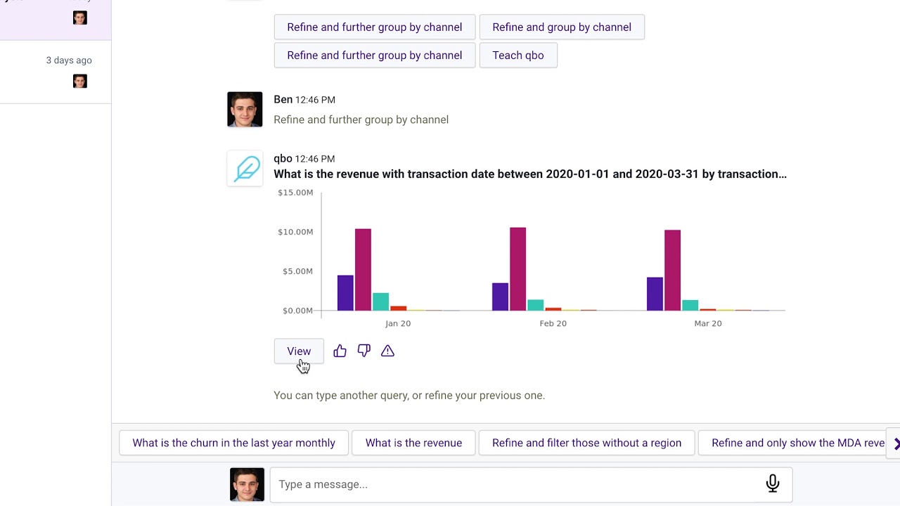
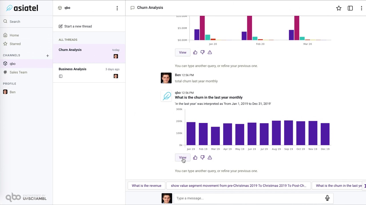
Provide feedback to the qbo about the result. The user can like, dislike the query result or report an issue with it by clicking on
icons respectively.
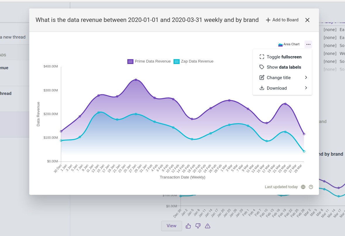
The query insight opens in a separate window showing the query insight in details.
Mouse-over the graphs for detailed values.
On the top right corner of the query insight window, click
Add to Board option.
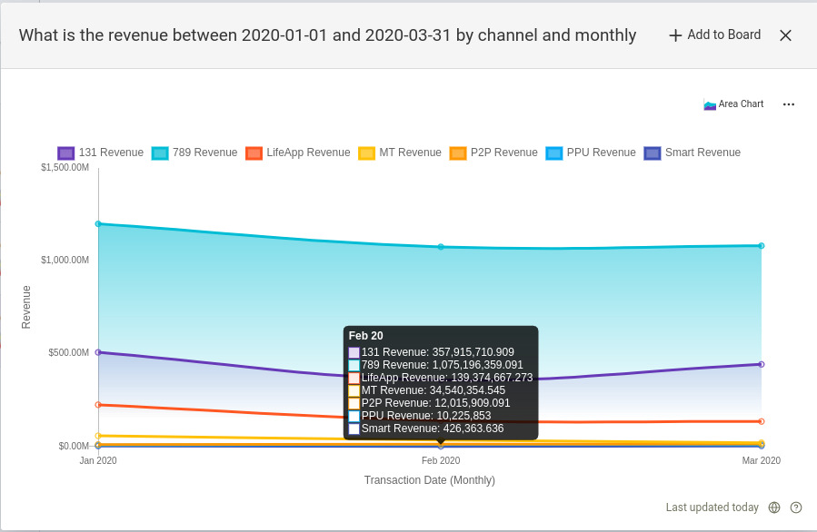
The vizy options seen here are a subset of vizy options available on the board. Let’s find that in the Explore Vizy Options section.
Explore board options
Note
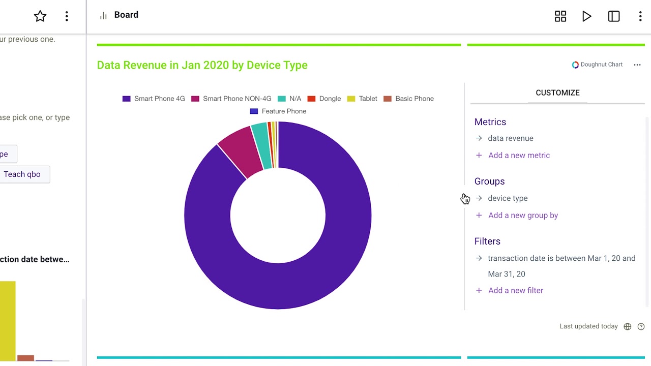
Once the vizy is added to the storyboard user can play with the data with various options available.
The chart is now added to the Board. Likewise, a user can pin all the insights to a Board. Addedd insight to the Board is called Vizy. A user can change the vizy layout, play it in presentation mode, remove it from the Board, download it as a pdf and much more. Let’s explore them one by one.
Related Videos
Pin and play wth qbo insights
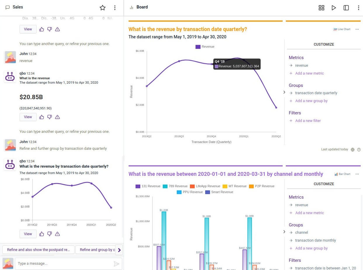
Board Options: The main options available which you can see on the top right corner are .
Change layout: Click on the box icon to sort the order of the vizies.
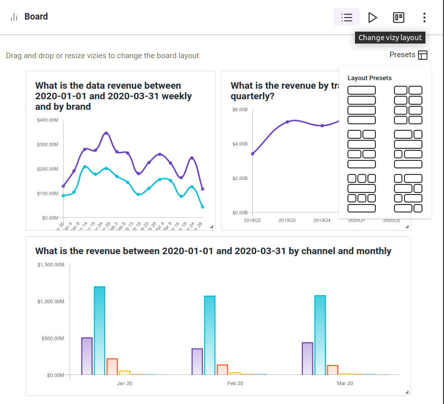
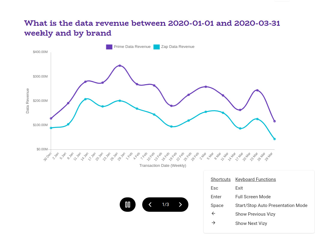
Presentation Mode: Click play to go into presentation mode.
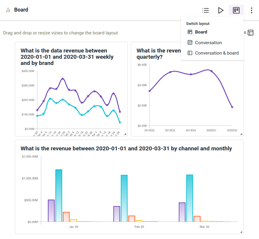
Switch Conversation & Board: Using this option users can switch between Board, Conversation and Conversation & Board layout.
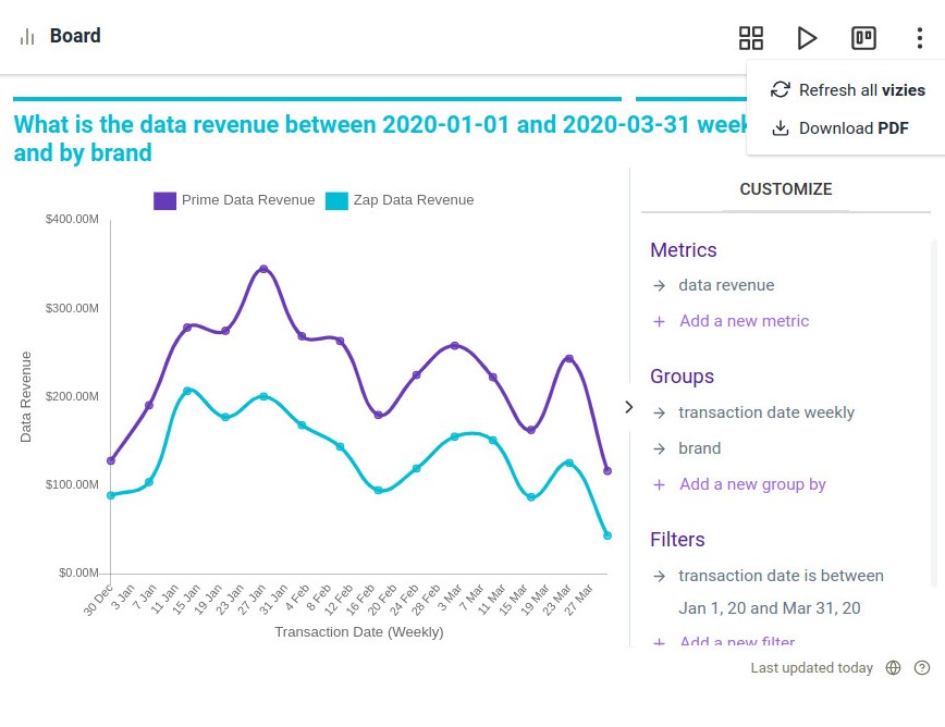
Click More: Use this option to refresh all vizies or to download the Board as PDF.
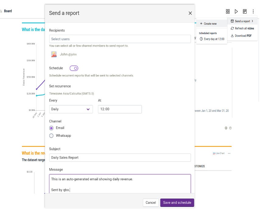
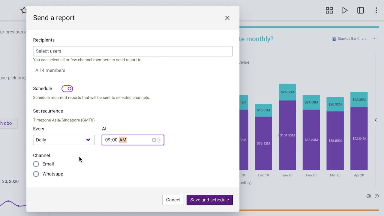
If the administrator has enabled Communication Services users will get an option to send reports and schedule reports as well. Users can create new reports, schedule periodic reports and delete existing reports.
Users can frame a report body, put a nice subject line and select users.
Explore vizy options
Now, let’s see various options available in vizy.
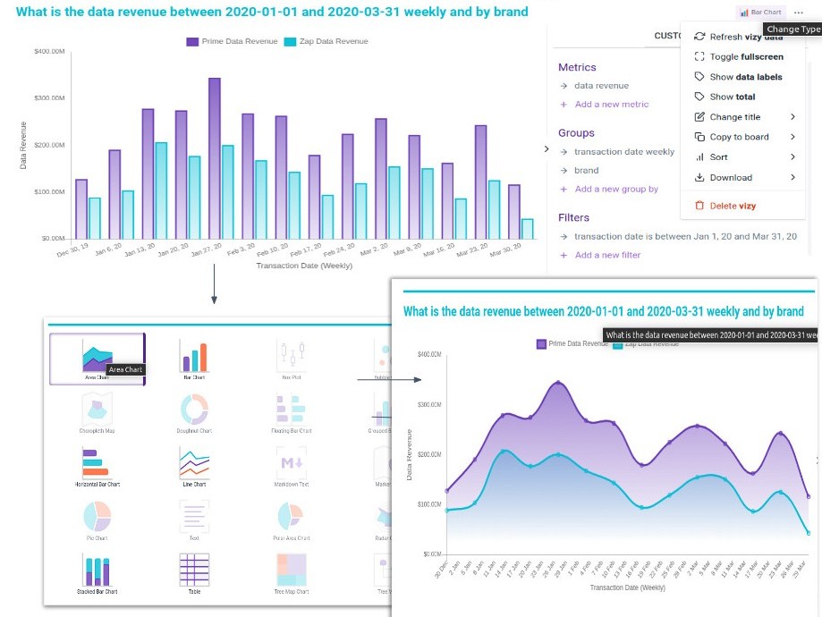
The user can refresh a vizy, view the vizy in fullscreen, change the chart type, and much more. Let’s see all the options one by one.
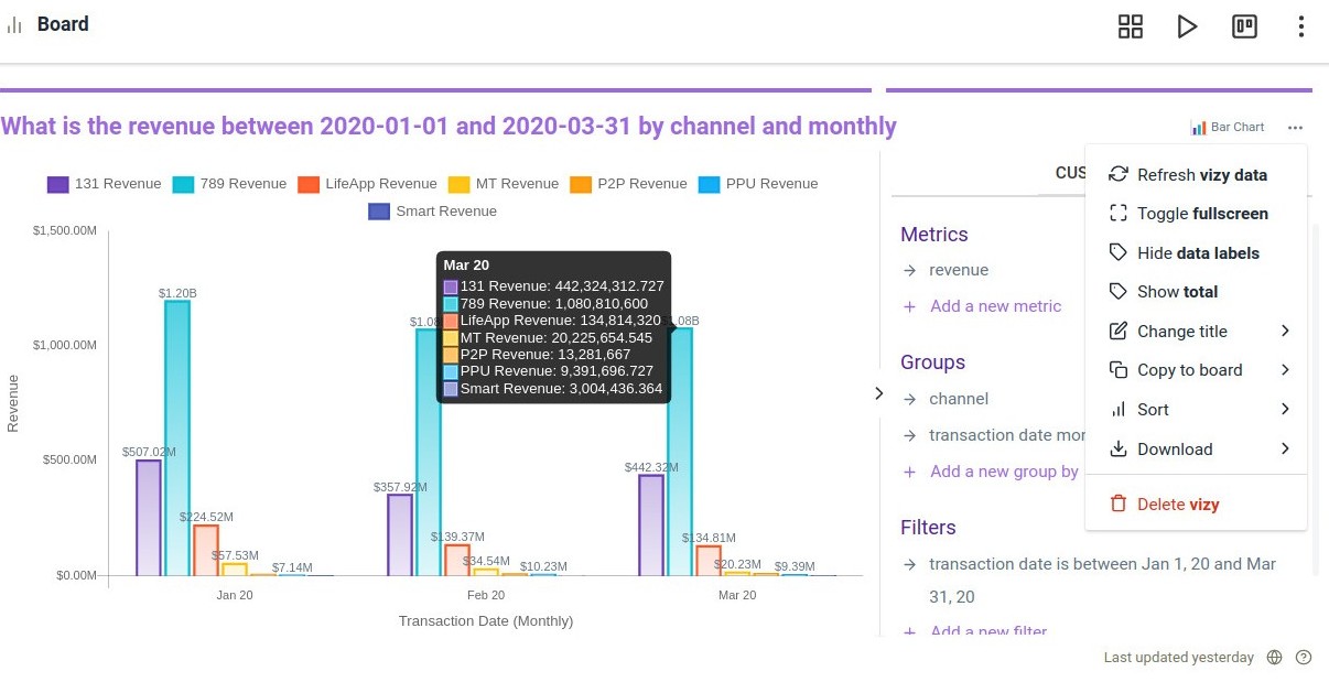
Change vizy type: Select the type of graph that you want for your visualization. qbo intelligently selects the supported graph type based on the number of variables in the output.
Refresh vizy data: Use this option to refresh a particular vizy.
Toggle fullscreen: Use this option to toggle between fullscreen and normal view.
Enable/Hide data labels: Enables/Disables the data labels on the data points for that particular vizy.
Show total: Use this option to view total in the visualizations for the comparison purposes.
Change vizy title: Allows users to change the name of the vizy.
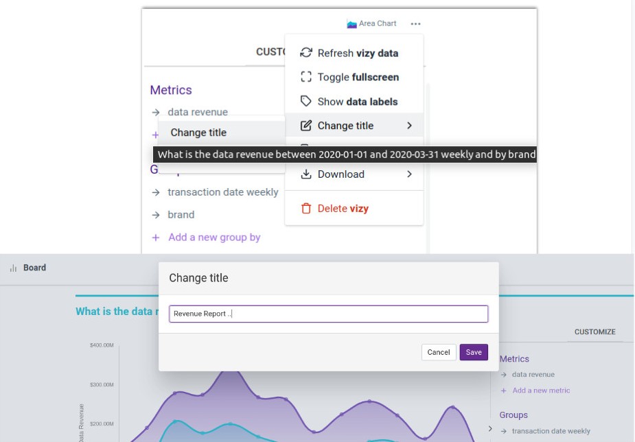
Copy to Board: Allows users to copy the vizy to other threads.
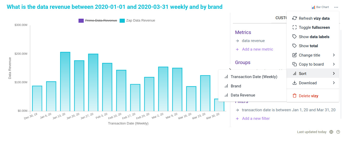
Sort: This option allows the user to sort the vizy output according to the legends available in it. With chart types like Bar Chart, Doughnut Chart, Horizontal Bar Chart, Pie Chart, Polar Area Chart, and Stacked Bar Chart, Sort gets enabled.
Download: Allows users to download the vizy either as CSV (comma-separated value), as an Image, or as a PDF.
Delete Vizy: Deletes the vizy permanently from the Board.
Note
You can customize your results by adding additional metrics, changing the grouping of the variables and adding filters. These attributes have been picked up from the underlying data during the configuration of qbo.
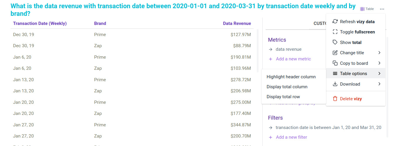
With a Table chart, Table Options gets enabled which allows the user to display or hide the rows and columns from the table.
Attention
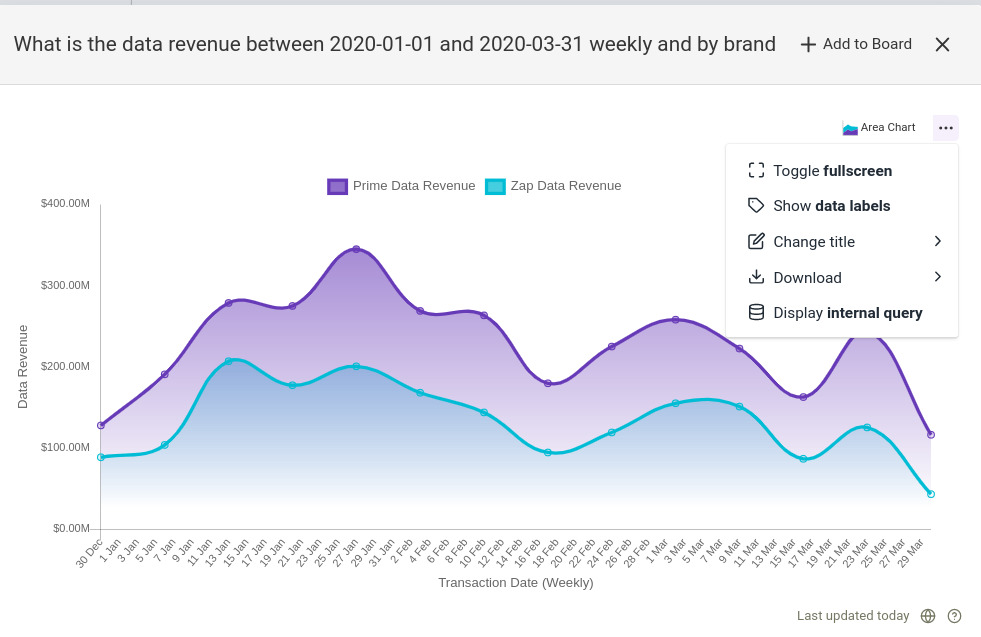
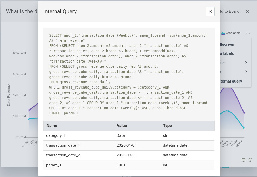
Verify your results by displaying the ‘internal query’ to show the SQL generated by qbo to retrieve the results that you see on your screen. You can run this query on the data source to retrieve the values for the visualization. The trick to see internal query is by pressing the Alt + three dot icon.
Drill down and compare from charts
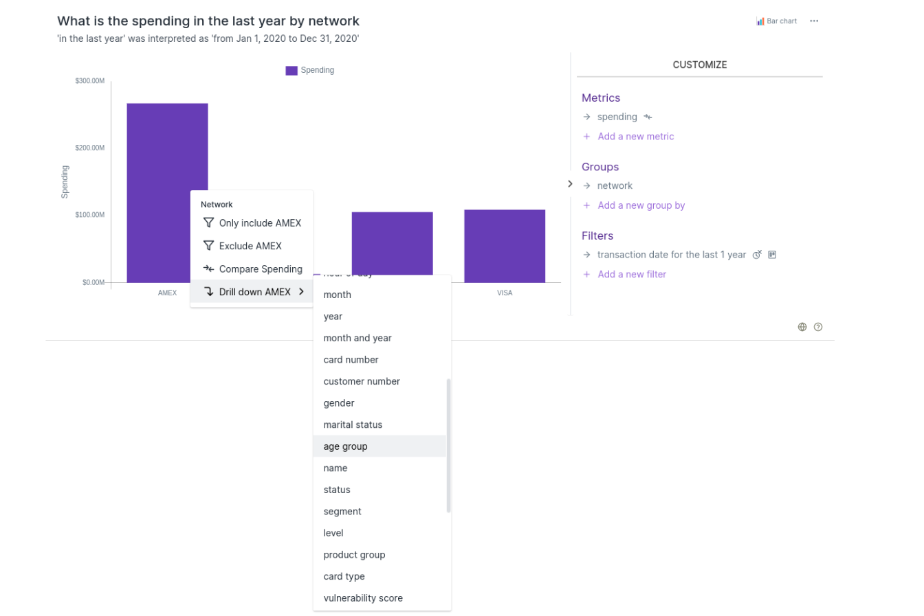
Drill down: Other than using the vizy customize functionality, it is also possible to refine the existing vizy output by using drill downs. To drill down, right click on the vizy and pertinent options for drill down will show up.
Example: Following vizy shows the spending analysis of different card networks.
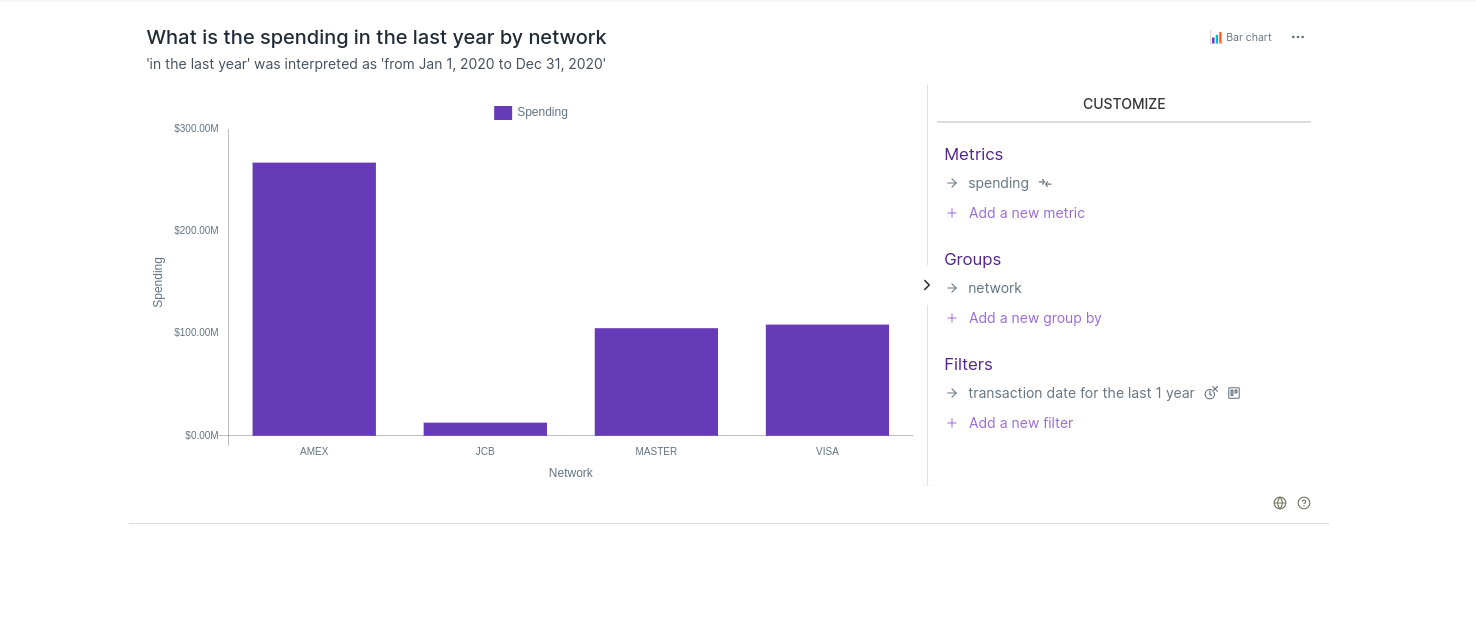
To analyse AMEX card spending by age group of users, keep the cursor over AMEX bar and right click and go on Drill down AMEX and select age group.
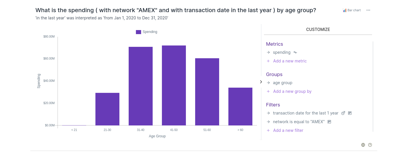
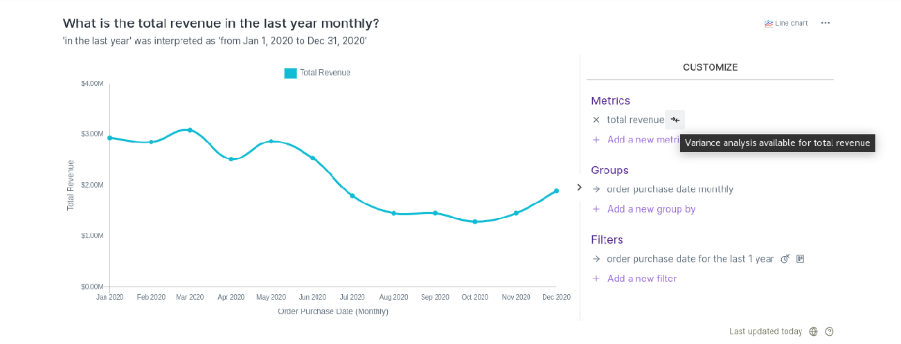
Compare icon: Clicking on this icon will show a modal that lets a user configure and run variance analysis for the corresponding metric.
Attention
This compare icon will only be visible when the metric (aggregate) is configured in the variance analysis configuration otherwise this icon will not appear.
