Chart types
To change the chart type of an insight displayed by Qbo, click the change type icon and select a chart type. Unavailable chart types will be grayed out.
The available chart types will differ depending on the columns used in your search. For example, if your search does not contain at least one geographical column, then you will not be able to use any of the geo chart types.
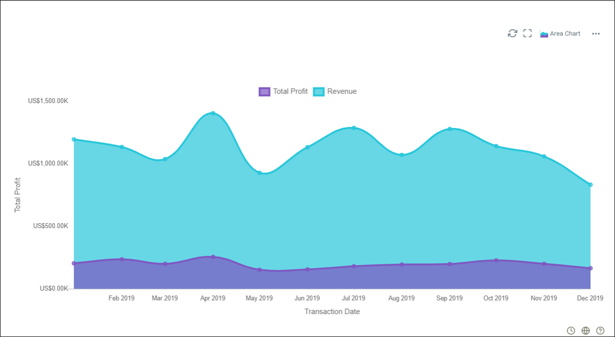
 Area graph
Area graphs are basically Line graphs but with the area below the line is filled in with a color or texture. Like Line graphs, these graphs are also used to display the development of quantitative over an interval or time period. They are most commonly used to show trends. The area between the x-axis and the line are colored in to compare different portions of the chart.
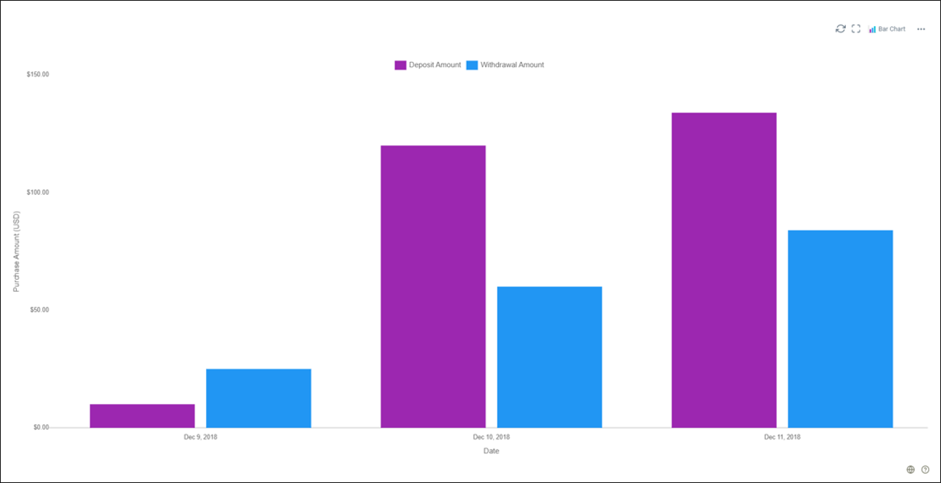
 Bar chart
Also known as a bar graph or column graph. A typical bar chart uses either horizontal or vertical bars to show distinct, numerical comparisons across categories. The search needs at least one attribute and one measure to be represented as a bar chart.
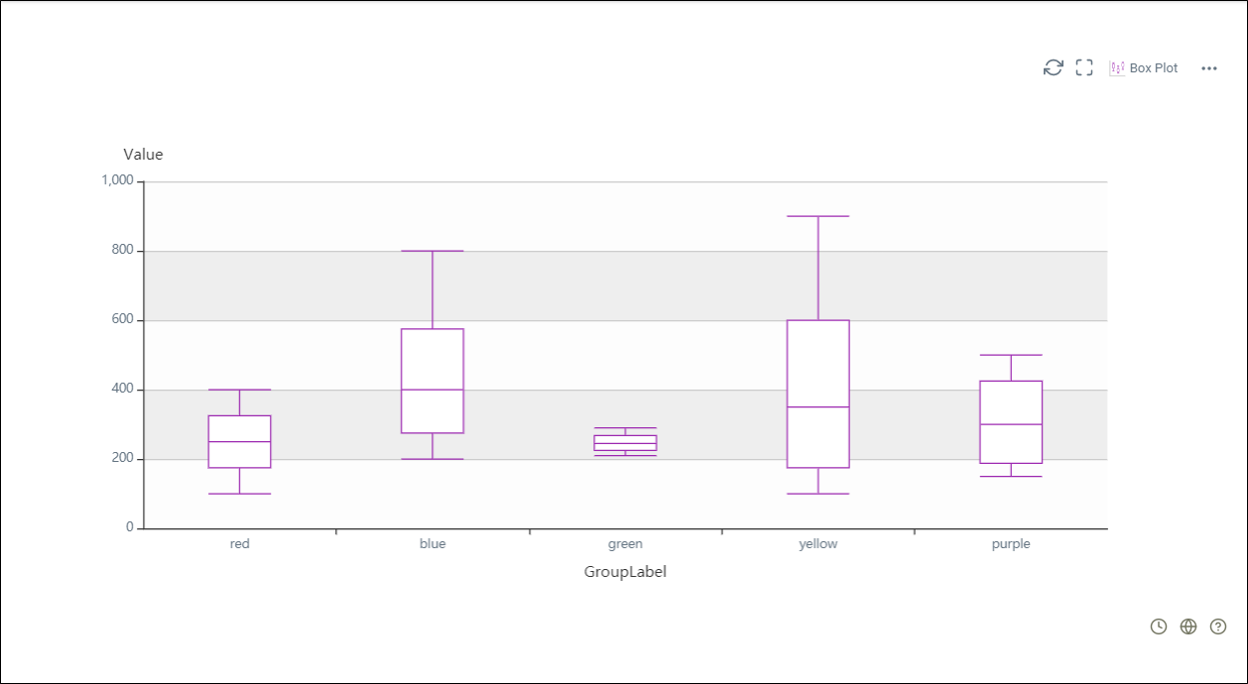
 Box plot
A box plot displays the dataset based on a five-number summary such as the minimum, the maximum, the sample median, and the first and third quartiles. The lines extending parallel from the boxes are known as the “whiskers” that indicate variability outside the upper and lower quartiles. Box plots can be drawn either vertically or horizontally.
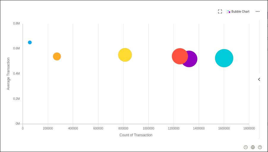
 Bubble chart
Bubble charts are typically used to compare and show the relationship between categorized circles, using positioning and proportions. It is a variation of of the scatter chart, with the data points replaced by bubbles.
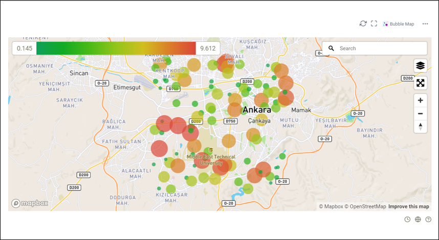
 Bubble map
A bubble map is a combination of a bubble chart data visualization and a map. It is used to visualize proportions related to location.
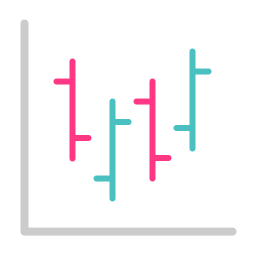 Candlestick chart
Also known as a Japanese candlestick chart. This type of chart is used as a trading tool to visualize and analyse price movements over time for securities, derivatives, currencies, stocks, bonds, and commodities.
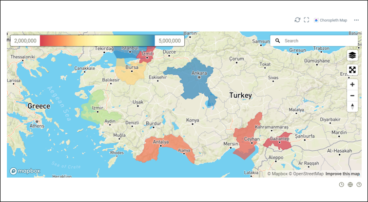
 Choropleth map
A choropleth map displays divided geographical areas or regions that are colored, shaded or patterned in relation to a data variable. It visualizes values over a geographical area, which can show variation or patterns across the displayed location.
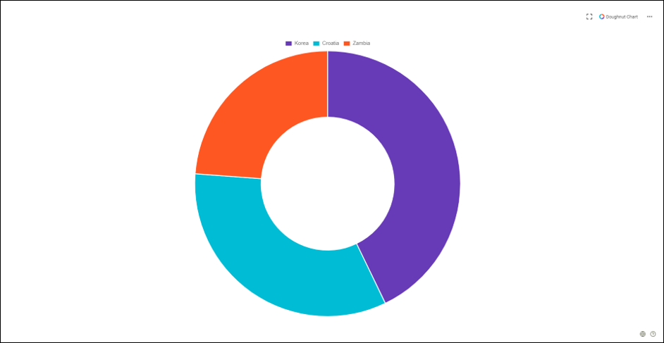
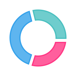 Doughnut chart
Doughnut chart is a pie chart with a center area cut out. It provides a better data intensity ratio than standard pie charts, as the blank center can be used to display additional or related data.
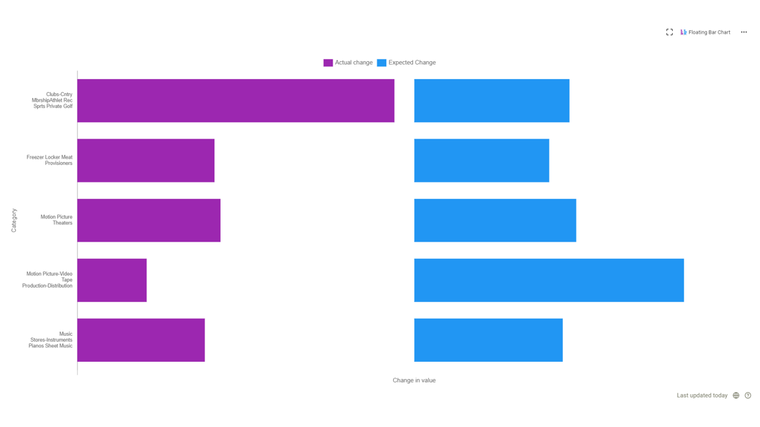
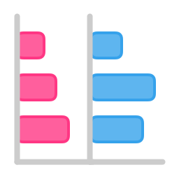 Floating bar chart
Floating bar charts are usually used to display the minimum and maximum values of data. The series of the chart does not connect to an axis, but above the axis.
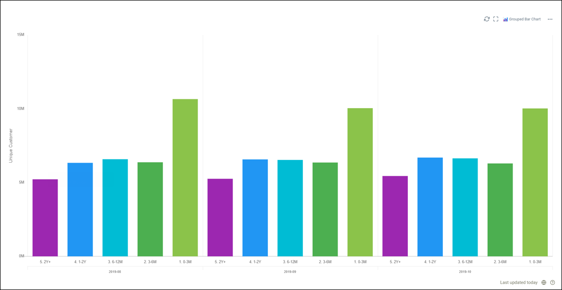
 Grouped bar chart
Also known as multi-set bar chart or clustered bar chart. It is used when two or more data series are plotted side by side and grouped together under categories, all on the same axis.
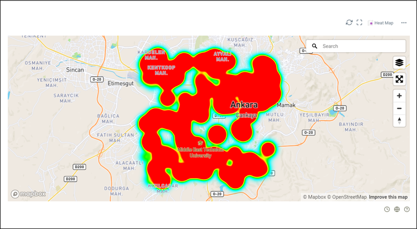
 Heat map
A heat map is useful for cross-examining multivariate data. It places variables in rows and columns and colors the cells within the table by value range. These are good for showing variance across multiple variables, revealing patterns, whether any variables are like each other, and if any correlations exist between them.
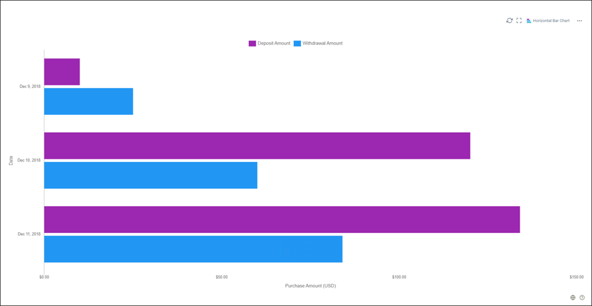
 Horizontal bar chart
A horizontal bar chart is a graph with rectangular bars of a length proportional to the values that they represent.
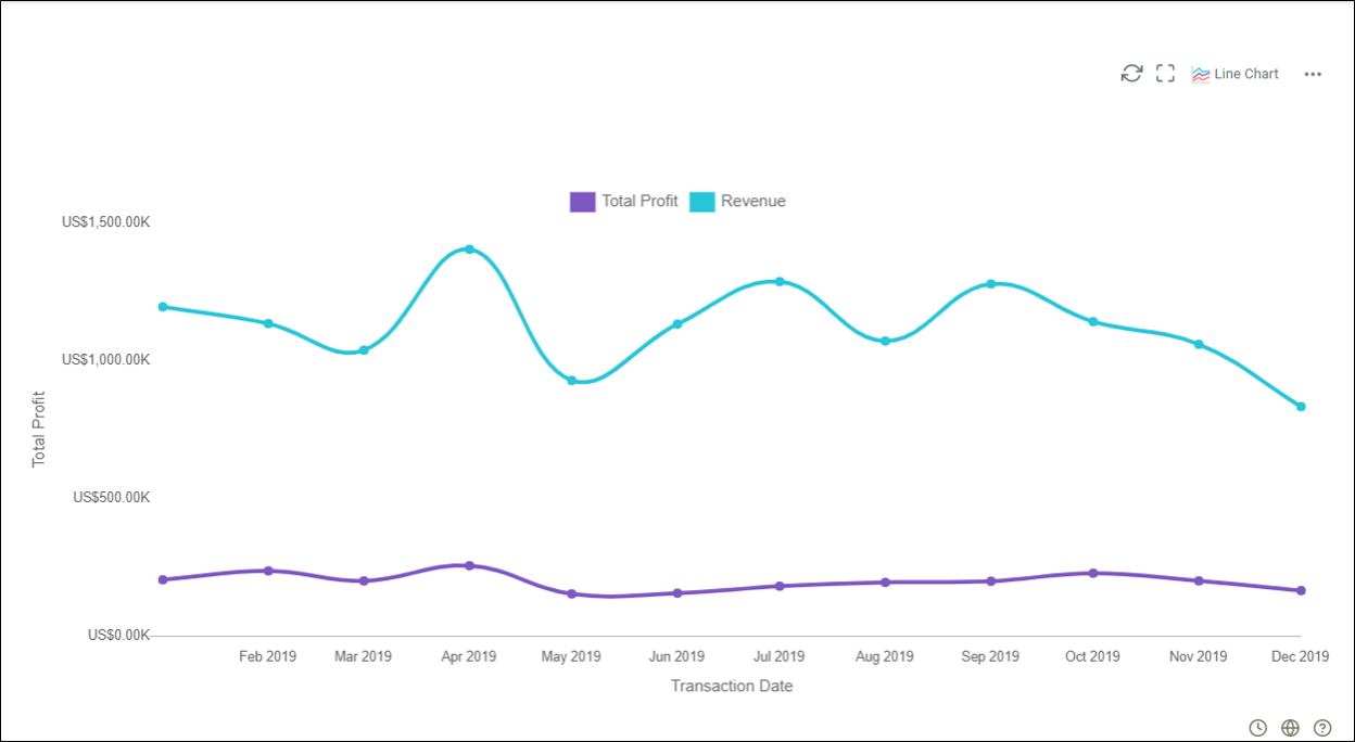
 Line chart
Line charts are used to display quantitative values over a continuous interval or time period. They are most frequently used to show trends and analyse how the data has changed over time.
 Markdown text
Markdown text allows users to write using an easy-to-read, easy-to-write plain text format, then convert it to structurally valid XHTML or HTML.
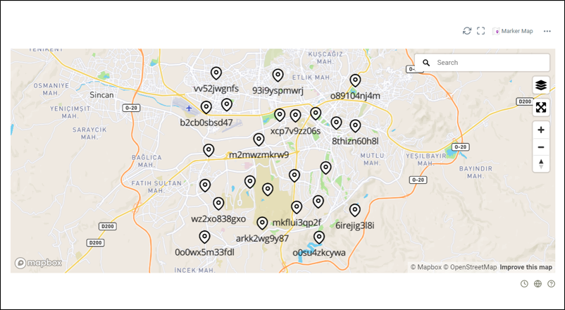
 Marker map
A marker map identifies a location on a map. By default, a marker uses a standard image. Markers can display custom images; these are usually referred to as icons.
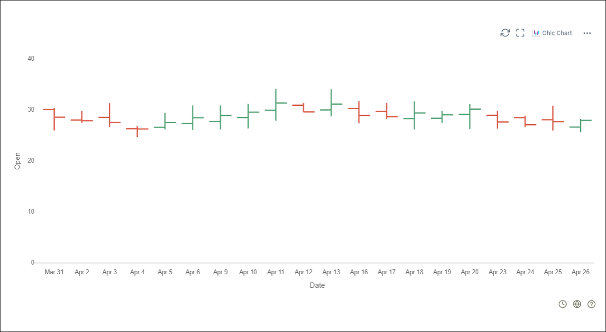
 OHLC chart
An open-high-low-close chart, also known as a price chart or bar chart, is used as a trading tool to visualize and analyze the price changes over time for securities, currencies, stocks, bonds, and commodities. OHLC Charts are useful for interpreting the day-to-day sentiment of the market and forecasting any future price changes through the patterns produced.
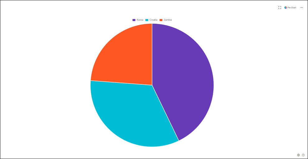
 Pie chart
Widely used in presentations and offices, pie charts show proportions and percentages between categories by dividing a circle into proportional segments. Each arc length represents a proportion of each category, while the full circle represents the total sum of all the data, equal to 100%.
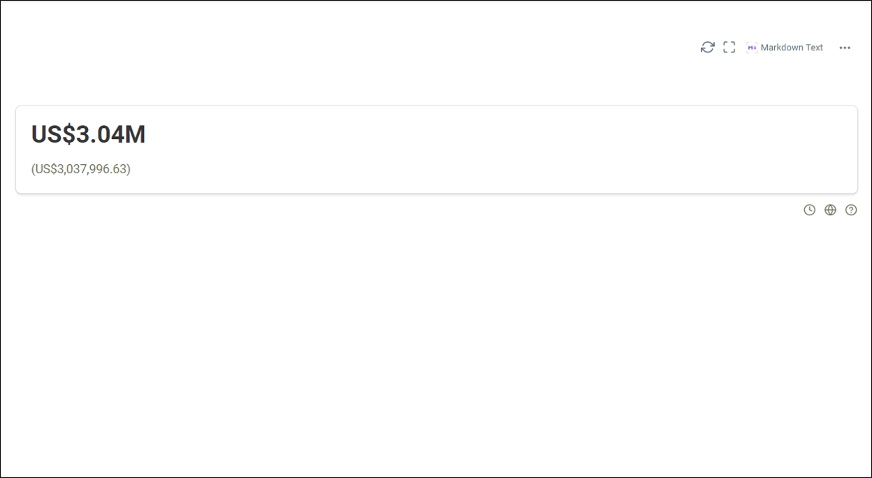
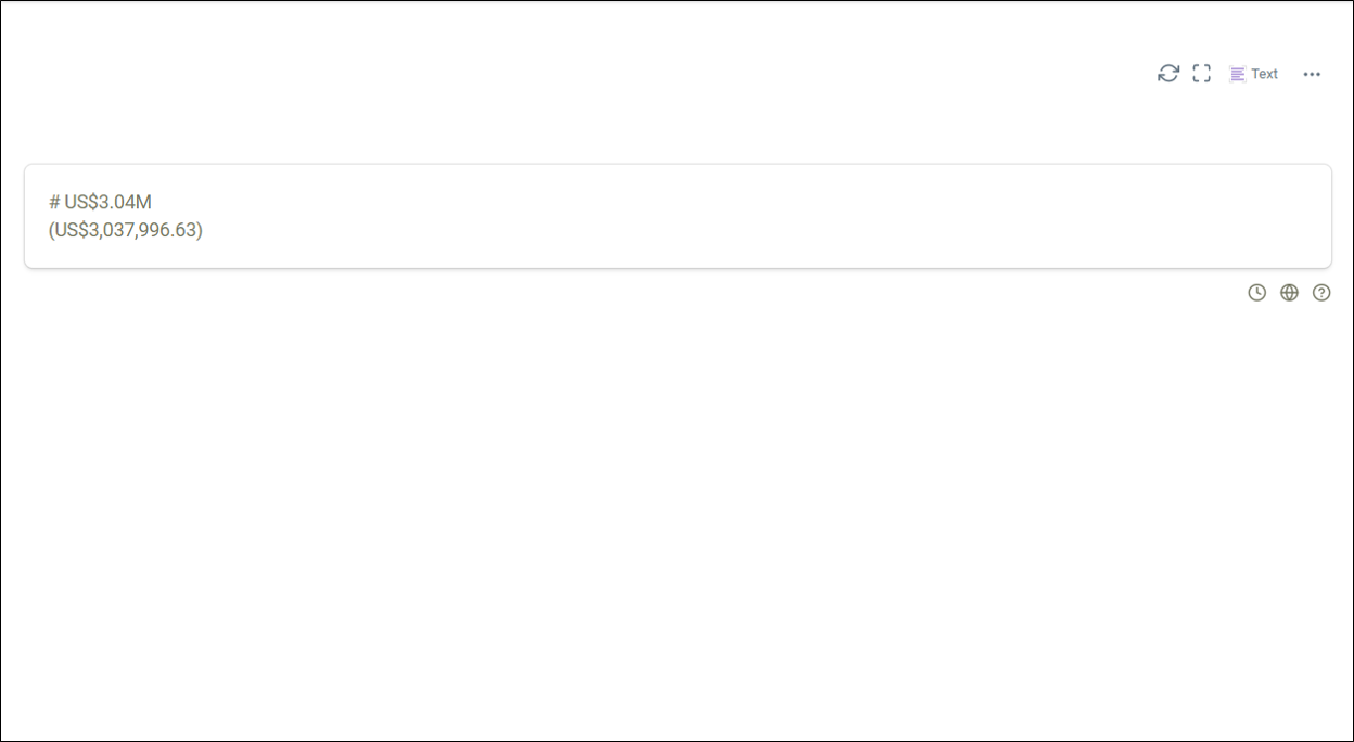
 Plain text
Data that cannot be represented in HTML, Markdown, or JSON format is shown in plain text or numerical format with a maximum of four values.
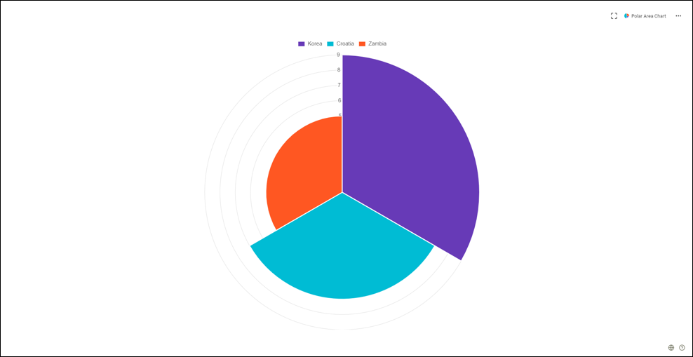
 Polar area chart
Polar area charts are like pie charts, but each segment has the same angle. However, the radius of the segment differs depending on the value. This type of chart is often useful when we want to show a comparison data like a pie chart, but also show a scale of values for context.
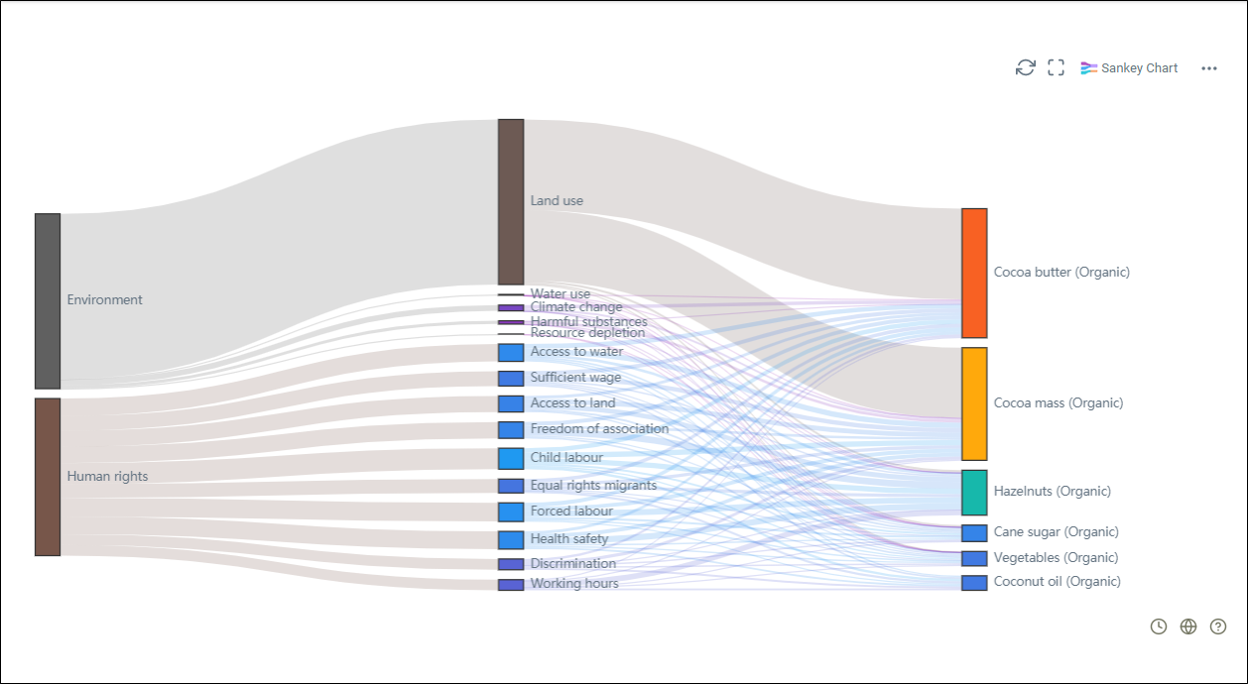
 Sankey chart
Sankey charts are typically used to show the transfer of energy, money or materials. They can be used to show the flow of any isolated system process.
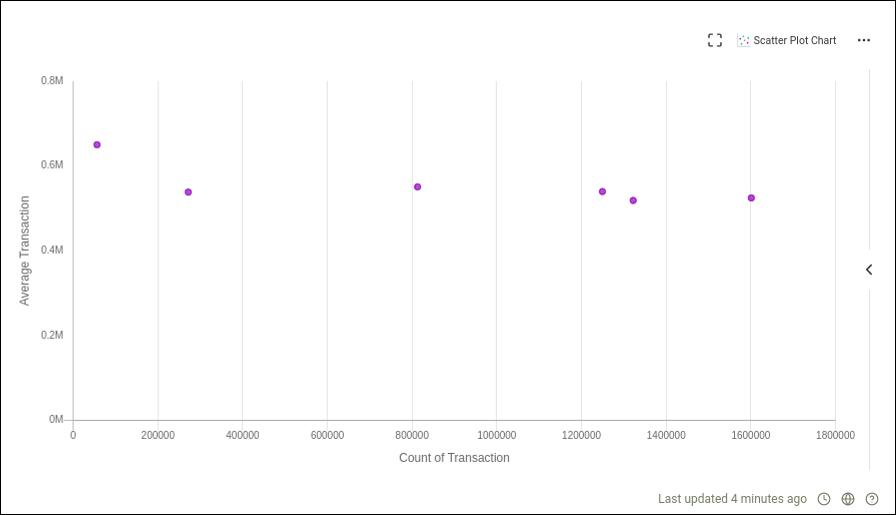
 Scatter plot chart
Also known as a scatter graph, point graph, X-Y plot, scatter chart, or scattergram. It is ideally used when you have paired numerical data and you want to see if one variable impacts the other.
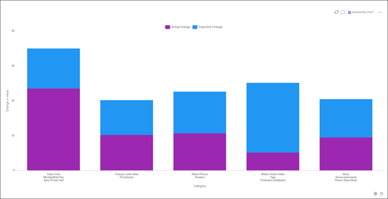
 Stacked bar chart
Stacked bar charts are useful for comparing multiple variables changing over an interval. It displays multiple datasets on top of each other to show how the larger category is divided into the smaller categories and their relations to the total amount.
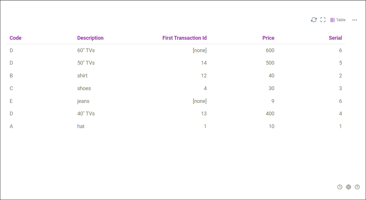
 Table
Table
A table chart arranges data in rows and columns. It shows the data in tabular format.
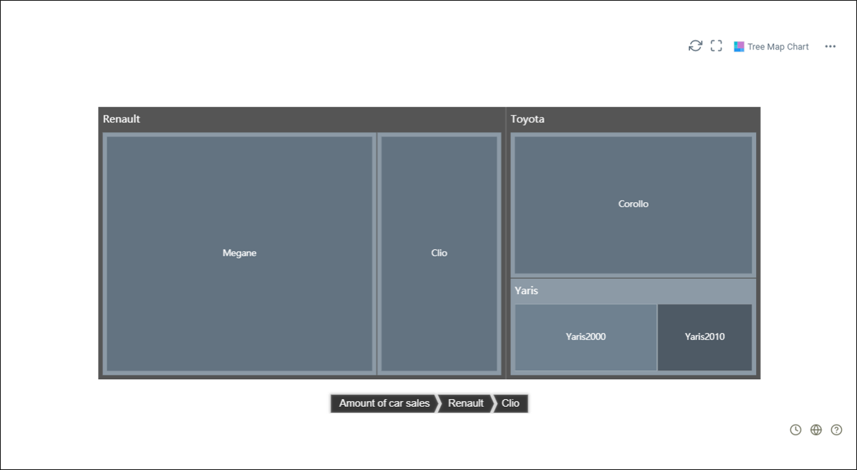
 Tree map chart
Tree map charts are an alternative way of visualizing the hierarchical structure of a tree diagram while also displaying quantities for each category using area size.
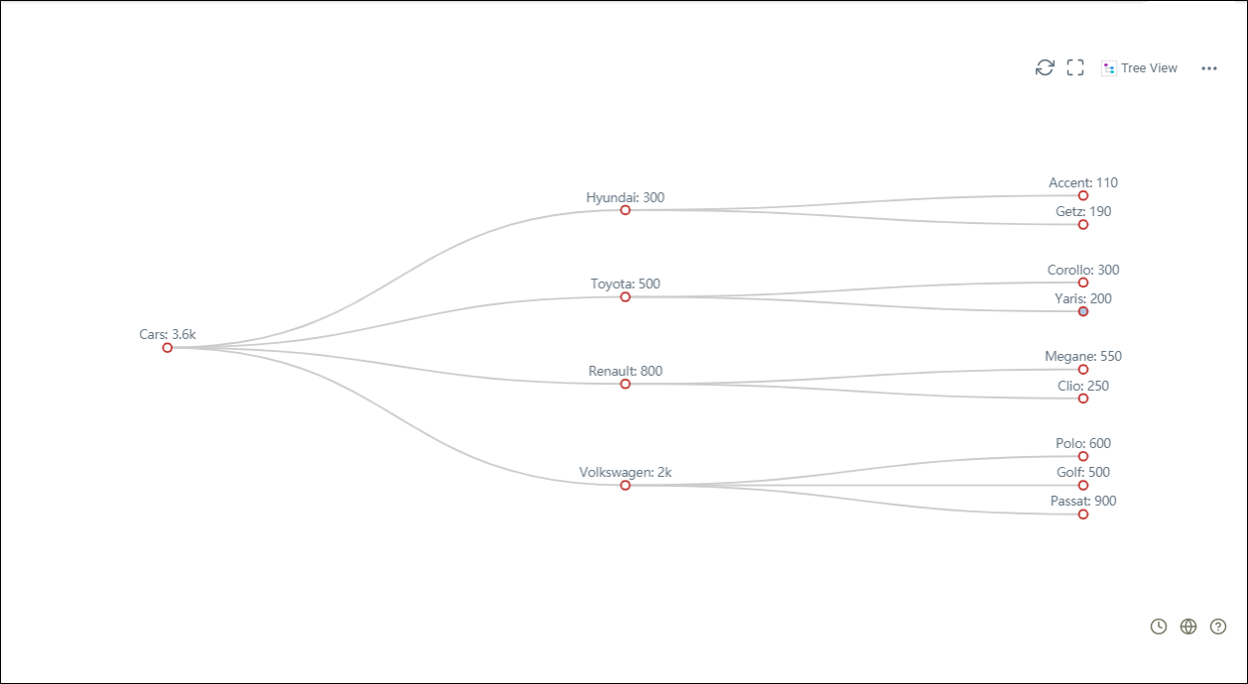
 Tree view
Also known as an organizational chart or linkage tree. It is used to visually represent a hierarchy in a tree-like structure.
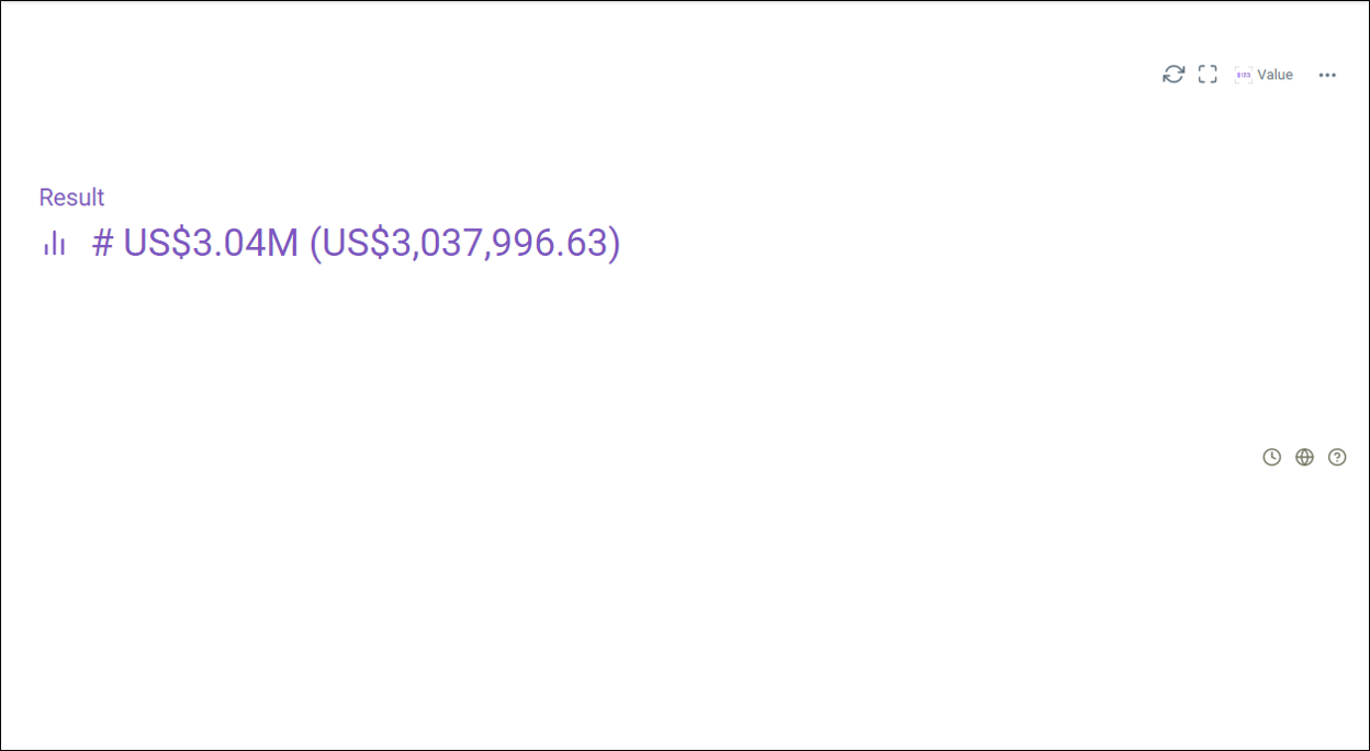
 Value charts
Value charts are used to analyze and predict future market movement by looking at oversold and overbought conditions.
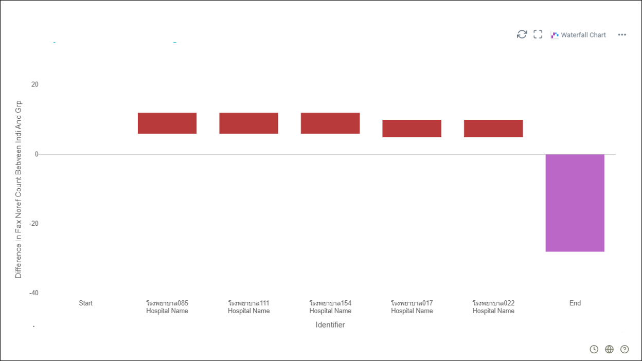
 Waterfall chart
A waterfall chart is mainly used to show how an initial value is affected by a series of intermediate positive or negative values.